

Designing Polygon Health’s AI-powered marketplace from 0 - 1
Designing Polygon Health’s AI-powered marketplace from 0 - 1

Designing Polygon Health’s AI-powered marketplace from 0 - 1
Project
UX Designer collaborating with PM and Eng Team
Project
UX Designer collaborating with PM and Eng Team
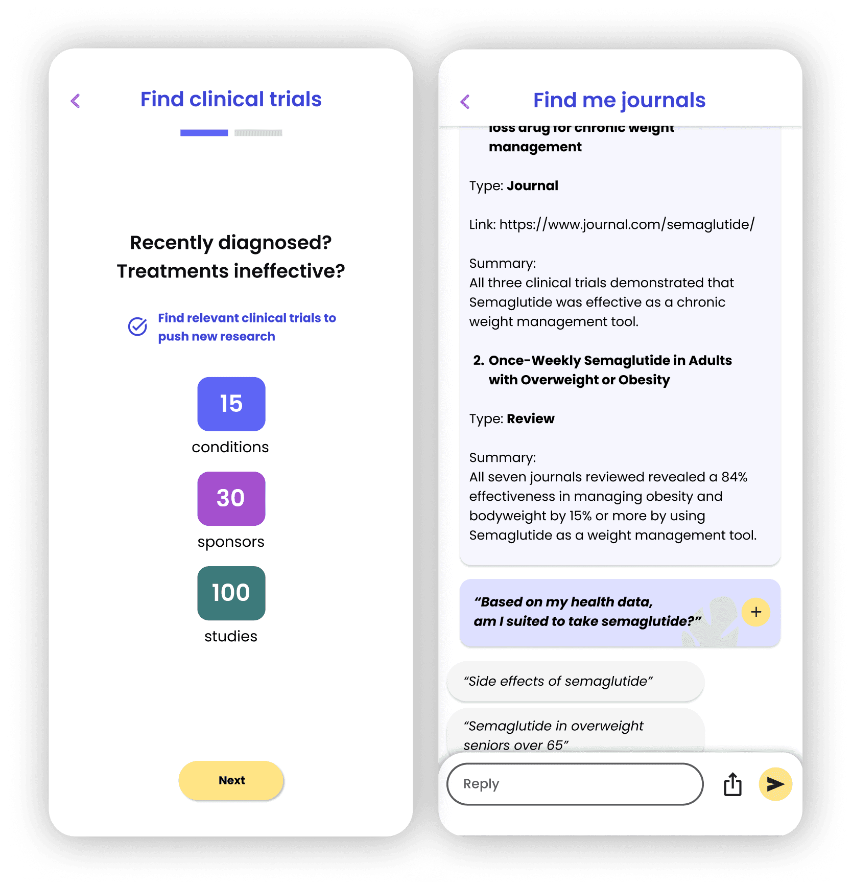
The final set of screens for the MVP marketplace feature
Polygon Health is an AI-powered tool that allows rare disease patients to access their health records and insights, all in one place.
Polygon Health is an AI-powered tool that allows rare disease patients to access their health records and insights, all in one place.
Designing a marketplace from the ground-up by:
Providing users an easy way to find insights on conditions and match them with clinical trials, making health data tools more approachable and trustworthy, and ultimately, grow product user base
Designing a marketplace from the ground-up by:
Providing users an easy way to find insights on conditions and match them with clinical trials, making health data tools more approachable and trustworthy, and ultimately, grow product user base
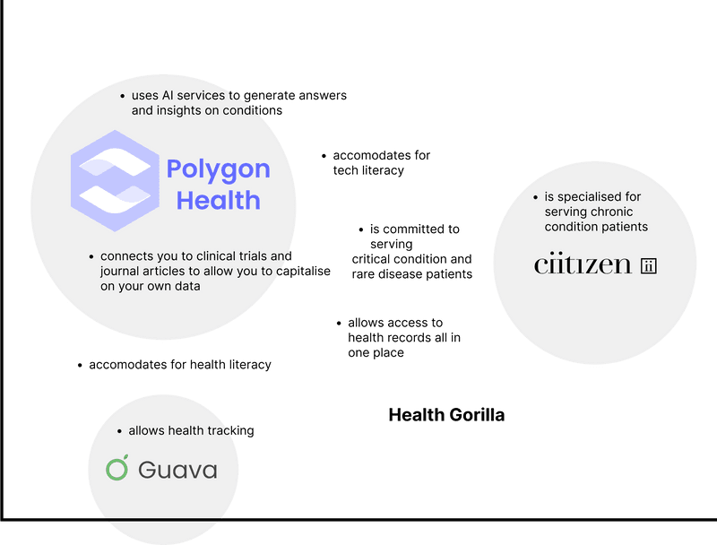
A competitive analysis of digital health tools
A competitive analysis of digital health tools
A competitive analysis of digital health tools
A competitive analysis of digital health tools
A competitive analysis of digital health tools
And keeping in mind the MVP constraints...
Polygon Health was in an MVP state within an emerging market that didn’t have clear bounds yet. Some constraints we considered were the small user base of patients with rare conditions, rough product state (MVP), data privacy and user trust, user accessibility (health and tech literacy), and the lack of a user research pipeline
And keeping in mind the MVP constraints...
Providing users an easy way to find insights on conditions and match them with clinical trials, making health data tools more approachable and trustworthy, and ultimately, grow product user base
And keeping in mind the MVP constraints...
Polygon Health was in an MVP state within an emerging market that didn’t have clear bounds yet. Some constraints we considered were the small user base of patients with rare conditions, rough product state (MVP), data privacy and user trust, user accessibility (health and tech literacy), and the lack of a user research pipeline
And keeping in mind the MVP constraints...
Polygon Health was in an MVP state within an emerging market that didn’t have clear bounds yet. Some constraints we considered were the small user base of patients with rare conditions, rough product state (MVP), data privacy and user trust, user accessibility (health and tech literacy), and the lack of a user research pipeline
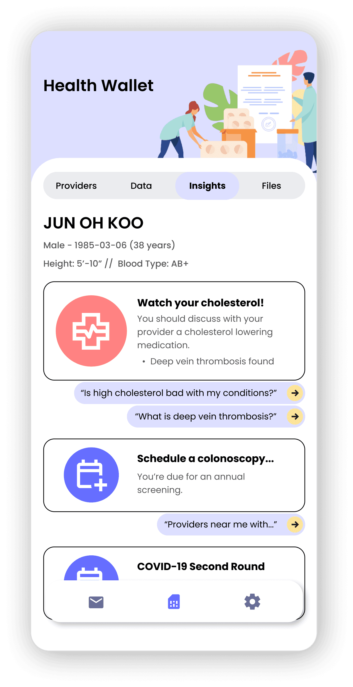
Building out the marketplace system diagram
This was our value proposition - to connect users with their clinical health data to capitalize on them for insights, the latest research and trials relevant to their rare disease condition.
Building out the marketplace system diagram
This was our value proposition - to connect users with their clinical health data to capitalize on them for insights, the latest research and trials relevant to their rare disease condition.
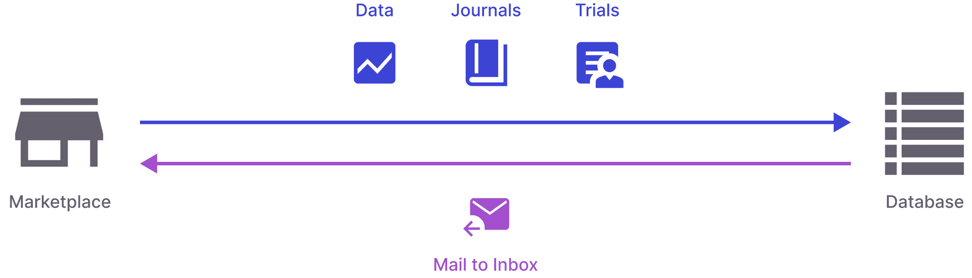
The system model of our product feature
The system model of our product feature
The system model of our product feature
The system model of our product feature
The system model of our product feature
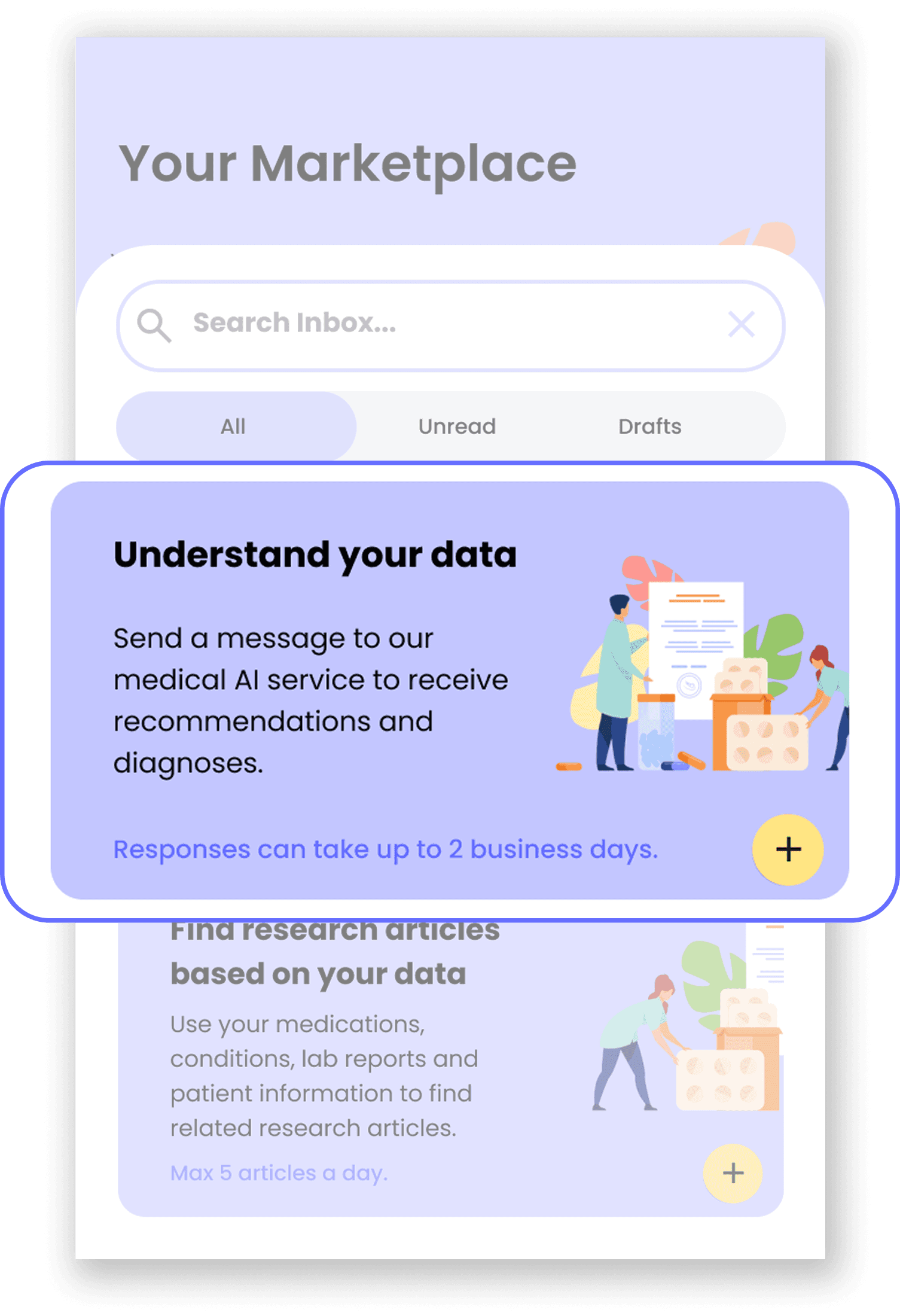
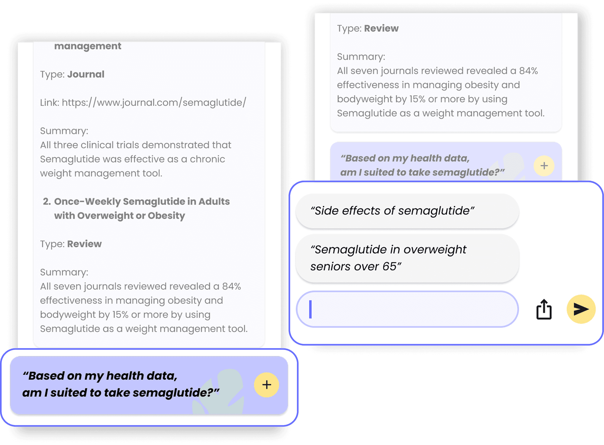
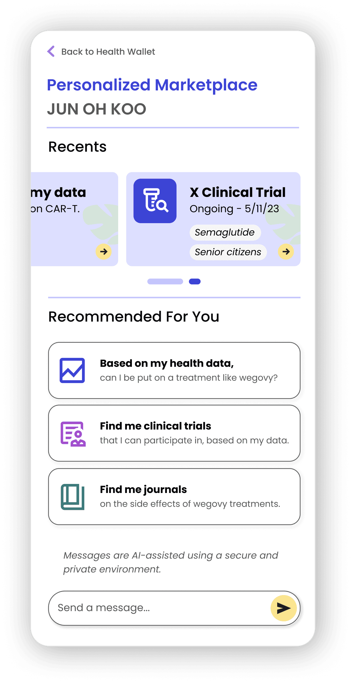
Designing the match-making experience
After defining the key components of this experience, I explored the following approaches to help users match with clinical trials.
Designing the match-making experience
After defining the key components of this experience, I explored the following approaches to help users match with clinical trials.
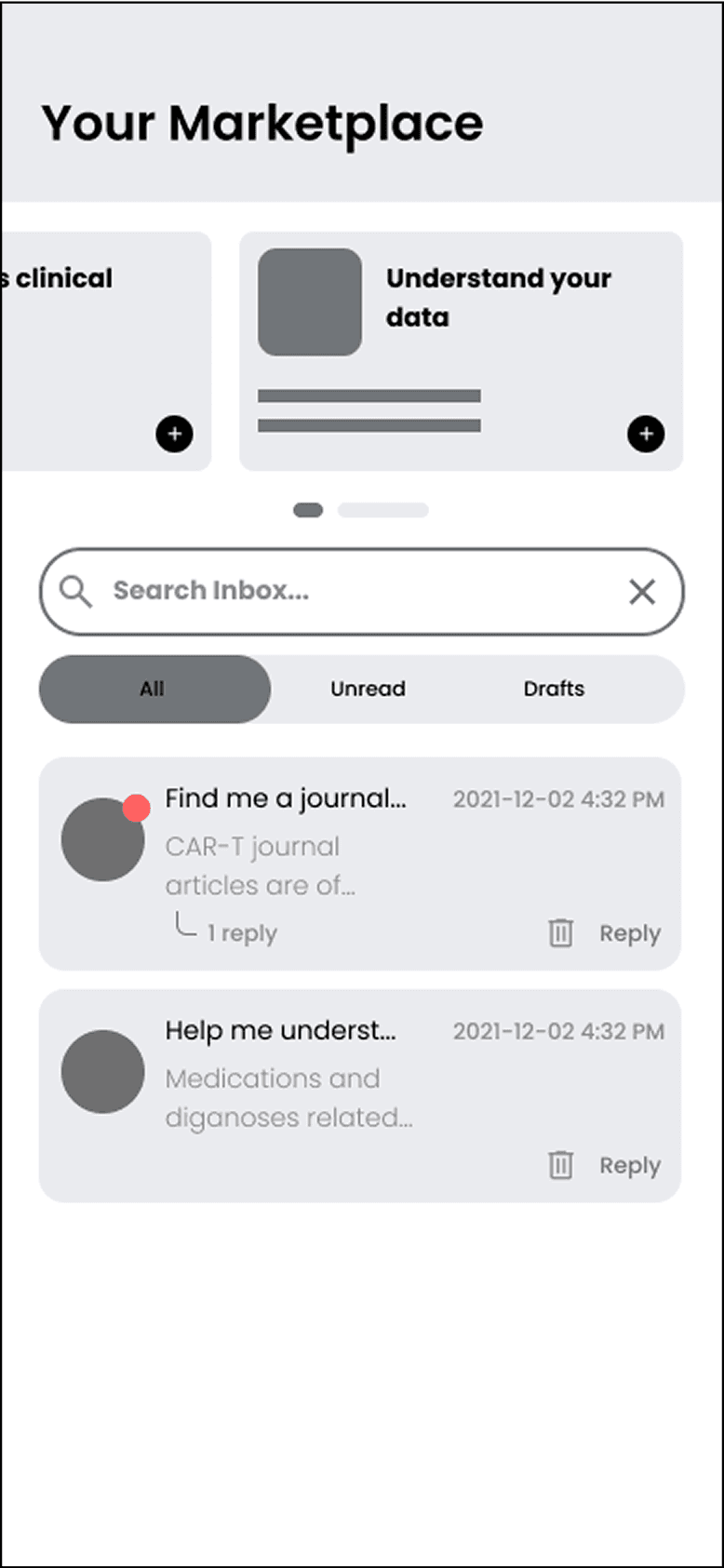
Carousel Concept
Pros
Accessible prompts
Contextual information
Cons
Not all features accessible at once
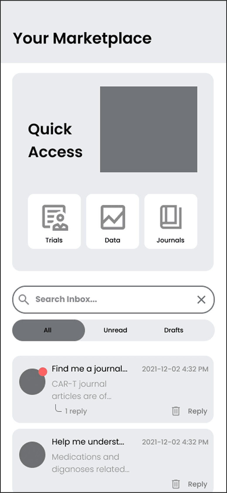
Wizard Concept
Pros
Quick, easy symbols
Isn't conducive to "inbox" concept
Cons
Lack of contextual onboarding
The carousel concept was chosen to match patients with trials and data
...due to contextual information affordances and smoother usability.
The carousel concept was chosen to match patients with trials and data
...due to contextual information affordances and smoother usability.

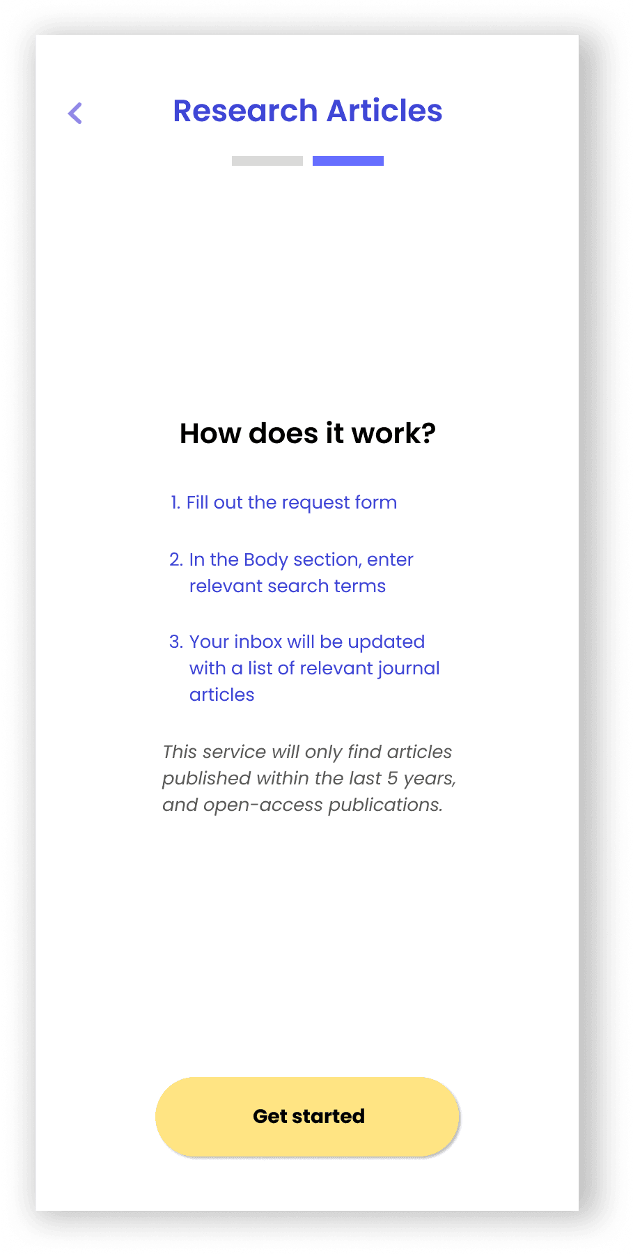
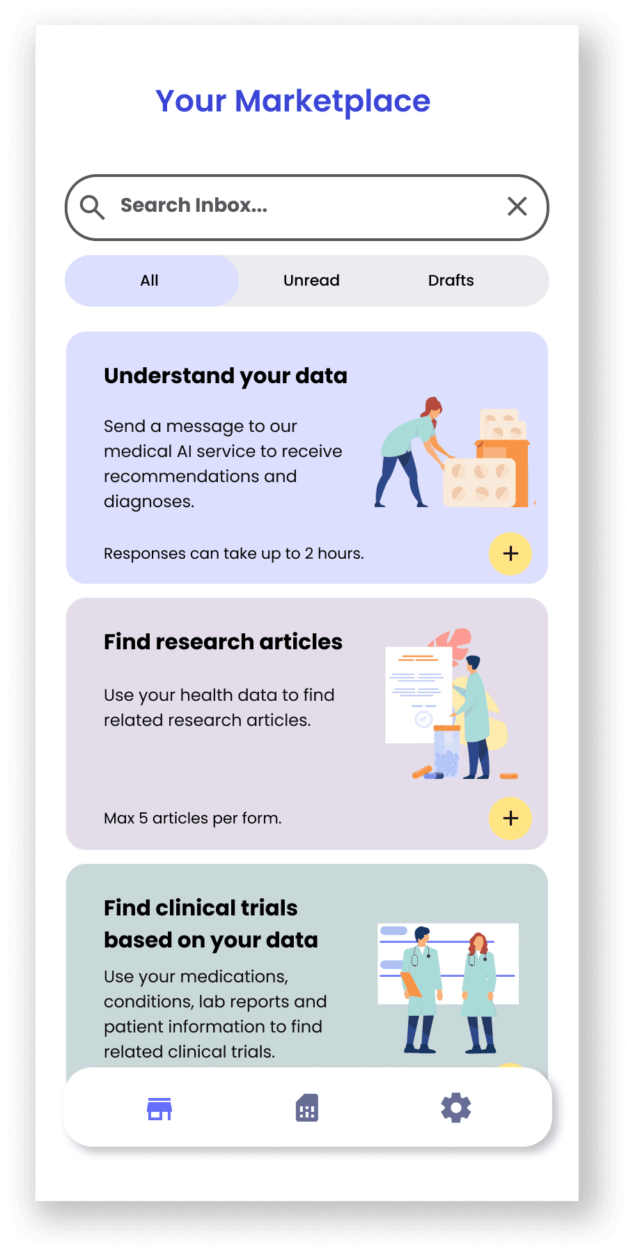
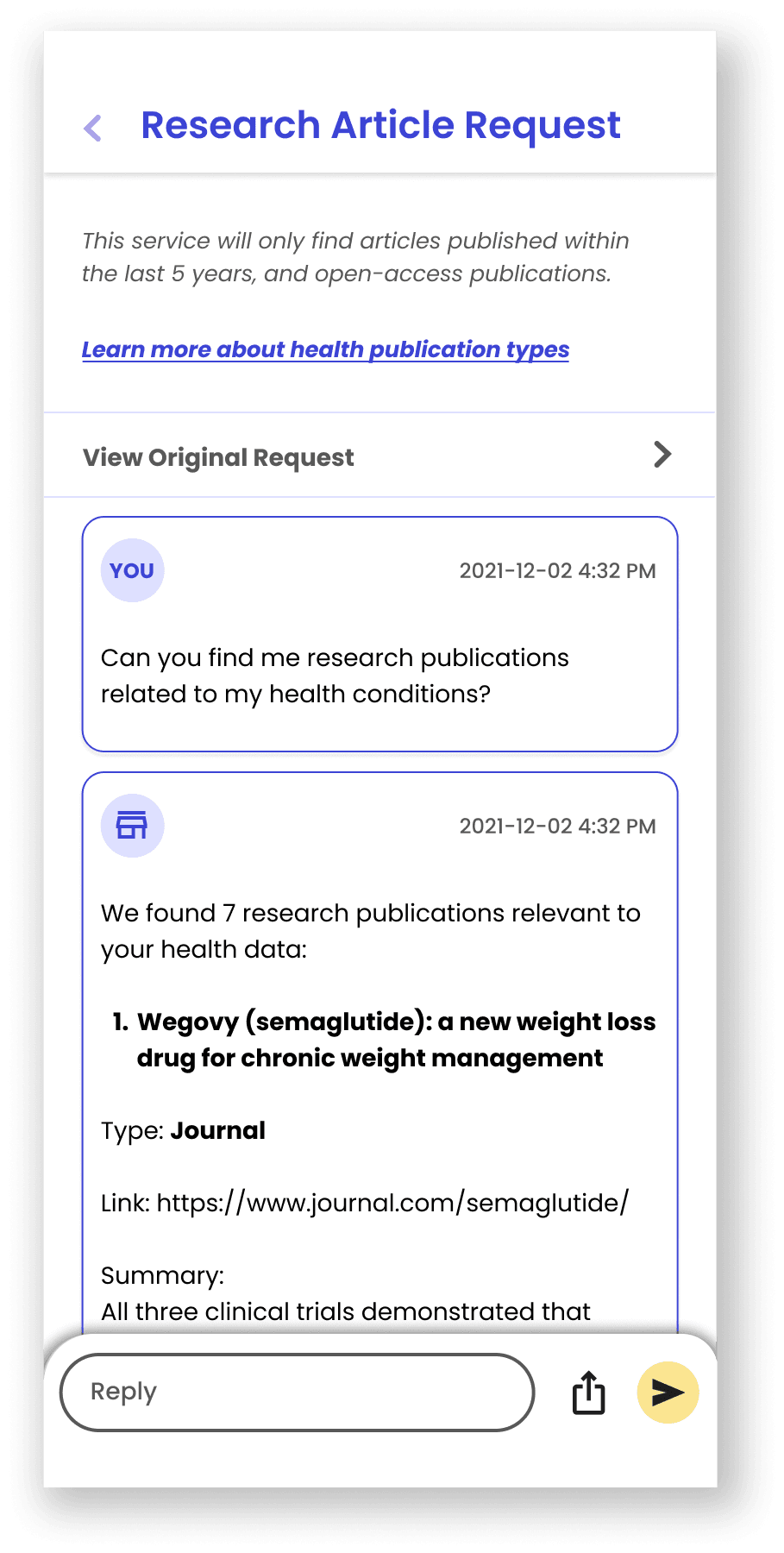
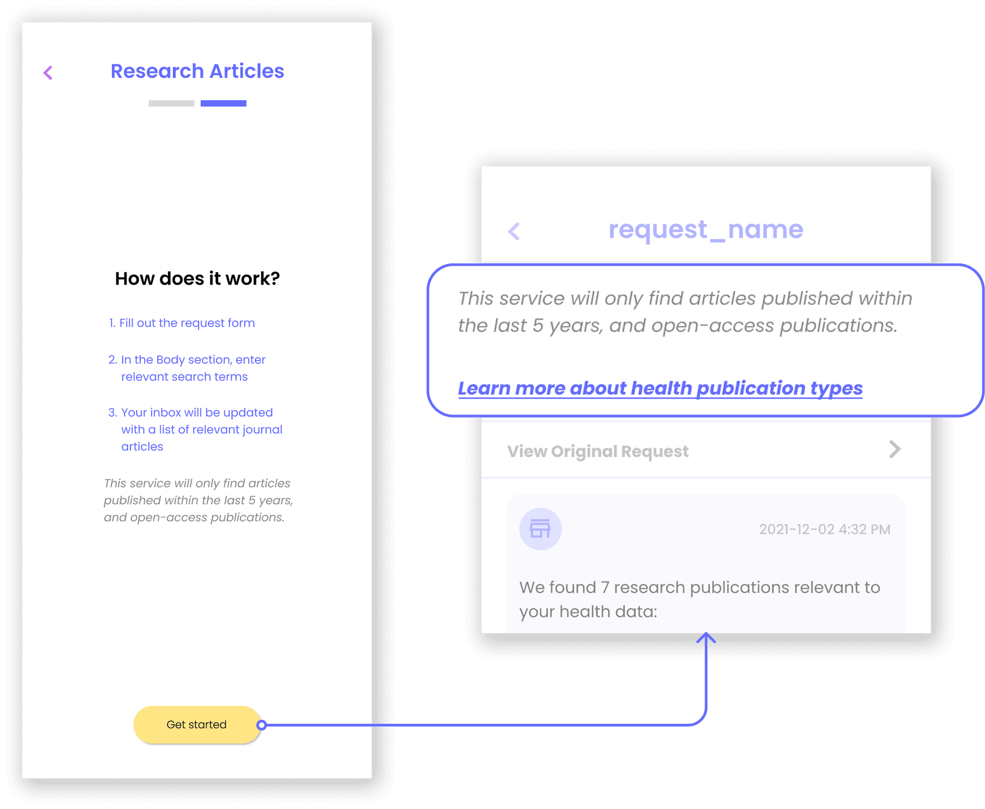
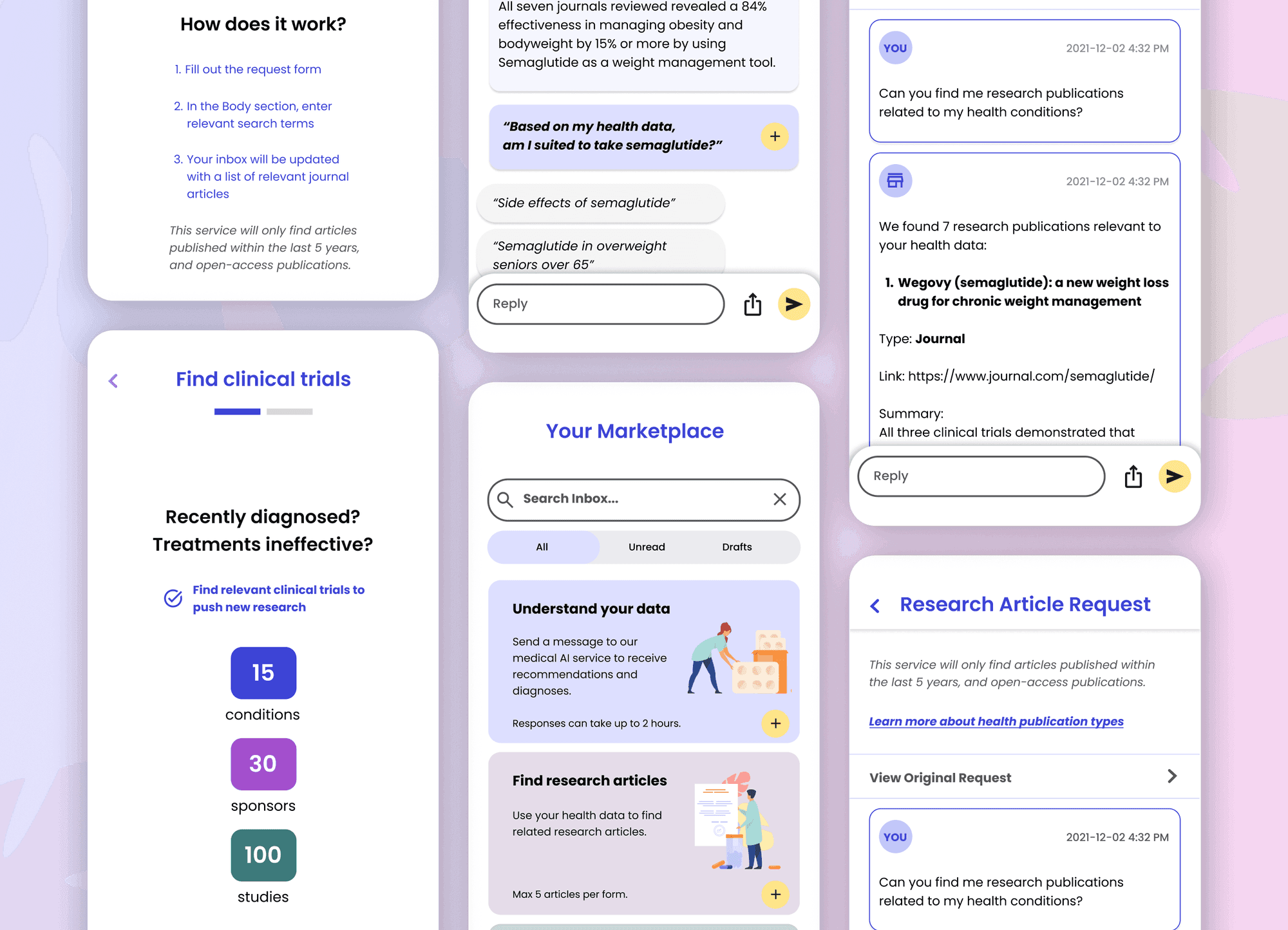
The core form submission user flow for the MVP
The core form submission user flow for the MVP
The core form submission user flow for the MVP
The core form submission user flow for the MVP
The core form submission user flow for the MVP
And we soft-launched our feature, and I drove in-depth user testing to gain insights
I took the initiative to design and conduct my own observation and A/B testing on our target user group to see if my solutions were effective. Testing revealed several changes to make.
And we soft-launched our feature, and I drove in-depth user testing to gain insights
I took the initiative to design and conduct my own observation and A/B testing on our target user group to see if my solutions were effective. Testing revealed several changes to make.
Change #1:
Action cards
Problem:
Tech literacy was a concern with the users.
Solution
The carousel concept was changed to include more description, and allow simple vertical scrolling interactions.The title cards were also moved below the inbox bar to keep with the conceptual inbox model.
Change #2:
Pop-ups and suggestions
Problem:
User testing revealed that users don’t always know what to ask, and the user journey from journal to understanding data was complex.
Solution
Different user generated suggestions were added, and connectivity between the 3 types of features was added.
Change #3:
Onboarding
Problem:
Health literacy was also an issue. Users expressed confusion on different terms.
Solution
Different tooltips and information pages were added as onboarding on-the-go.
Feature is released to the public
I was able to drive user-validated changes to the MVP, and we released a newly iterated feature to the public.
Using this HMW I conducted more thorough in-depth user interviews with the content team and conducted studies on the principles of CMS design.
Feature is released to the public
I was able to drive user-validated changes to the MVP, and we released a newly iterated feature to the public.
Using this HMW I conducted more thorough in-depth user interviews with the content team and conducted studies on the principles of CMS design.
A solution that spoke to rare disease patients
A solution that spoke to rare disease patients
A user trial with the user group
A user trial with the user group
A user trial with the user group
A user trial with the user group
A user trial with the user group
"
Super simple and easy to use, and brought me to next questions I hadn’t even thought of...
- Early user
"
Super simple and easy to use, and brought me to next questions I hadn’t even thought of..."
- Early user
North Star Ideas
Exploring future directions for the product with a focus on enhanced form submissions and expanded use cases to improve precision, insights, and collaboration.
North Star Ideas
Exploring future directions for the product with a focus on enhanced form submissions and expanded use cases to improve precision, insights, and collaboration.
North Star #1
AI-powered precision matchmaking
North Star #2
AI-powered Health Insights
Moving Forward
I'm super grateful that I was able to work on a project to drive impact for people with rare disease conditions. The startup environment taught me how take ownership of my role and to take initiative. I designed and conducted my own user testing. I kept in dialogue with potential users. I made the case to push product agendas.
Huge thanks to Weilin and the rest of the team at Polygon Health for the experience and mentorship!